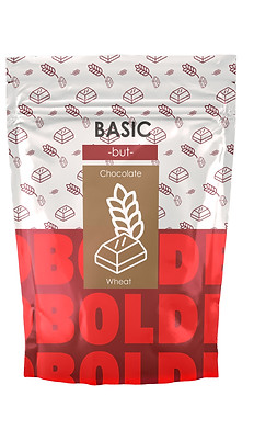
BASIC BUT BOLD
Branding
Marketing
ROLE
Packaging Designer
Art Direction
TEAM
Solo
YEAR
2022
TOOLS
Illustrator, Photoshop
BACKGROUND
St. Amour is a food company that manufactures healthy food products. Dedicated to addressing with delicious treats the special dietary needs of many as well as the general public. St.Amour came to me as a client needing a solution to their lack of sales from a designer perspective.
THE PROBLEM
St. Amours' problem is primarily The product was not being sold as much as projected. The company is trying to find a potential solution to this lack of sales.
THE SOLUTION
When approaching this project, I outlined some goals I wanted to accomplish with this problem.
-
Redesigning their packaging.
-
Why? In looking at their packaging, it can be seen that it is outdated and in need of a new style and energy.
-
-
Renaming the product.
-
Why? Renaming, while an optional avenue given by the client, would seem to be a good course of action for this overall refresh take on the products brand identity.
-
THE PROJECT
THE MISSION
In my investigation, I wanted to see what was the general look and feel that people were getting. I wanted to get a good look at the product from an outside source. From a sample size of twenty-five people, their take on the packaging was similar to my own. With the majority responding negatively toward the current packaging design. With this data, I pressed forward knowing that this new design is a bold one.
Adhering to this new design the three core pillars where two being the target market, healthy and active paired with a bold new look set my path to a stunning design.

WHAT CAN WE SEE?
THE DIAGNOSIS
In my analysis of the packaging, I broke down to the client what I believed could be changed or removed from it.
SUGAR-FREE TOO PROMINENT.
BASIC POWER NAME NOT WORKING.
THE BACKGROUND IS NOT EYE-CATCHING.
DO WE NEED THE WINDOW?


OUR COMPETITION
THE EXAMPLE
The competition for healthy food has been at an all-time high in recent years. With it, a plethora of new healthy food brands have been made. For my design to thrive I needed to look at St. Amours competition. A prime example I looked at during my research was the brand Kind.
Kind had a very geometric design it and used colors similar to that of Power Granola. Kinds' packaging while simplistic had only one thing going for them in its design. The name and the colors it associates with in its logo. The packaging design overall was not eye-catching so I wanted to go a complete opposite direction.
the takeaway I needed from this packaging was I wanted to make the new name as effective as Kinds'. Along with its use of color can make my design affective one.
HOW DO WE FEEL NOT SO... BASIC?
THE CHALLENGE
The challenge was to turn this brand into something that stands out from our competitors. That shines as the high demand for the audience we are catering towards. How
do we go from being basic to having a bold new look?
THE DIRECTION
I saw this opportunity with the basic element within power granola and played to it as if it were a strength. Showing polar opposites of Basic but also Bold can have a new fun and exciting packaging design.


SKETCHES
The process for this took many tries. The first was figuring out the name. Coming up with all different types of names, and seeing what was the best combination of words to use? Next was the layout, and how to show off this parallel between the two to make an effective design.
-
Basic but Bold
-
Basic and Bold
-
Basic Bold

EXPERIMENTING
The process for this took many tries. The first was figuring out the name. Coming up with all different types of names, and seeing what was the best combination of words to use? Next was the layout, and how to show off this parallel between the two to make an effective design.
-
Basic but Bold
-
Basic and Bold
-
Basic Bold


I liked the Bold contrast with the red.
I wanted to play around more with the pattern
I wanted to go more illustrative with the imagery
I liked the Bold repeating.
Didn't like the illustrative food as the center piece. people can not see that as chocolate.
Basic was getting lost needed a new logo design

I liked the neon Color direction I was going with.
Needed to get rid of that coffee/wallpaper pattern in the design.
I did like the logo and was moving forward with it.
FINAL RENDITION
The product created was done effectively showing off a Bold new design and name, I effectively reached the goals I set out for this project. Showing off multiple flavors, advertisements, and social media can really sell this design.


FINAL THOUGHTS
Overall the experience of working on this project was rewarding because I completed the milestones I aimed to hit. A couple of things I would have wanted to do as the next steps would have been to;
-
Create more advertisements.
-
Why? Because as a concept to be successful the more I could sell the design or concept the better.
-
-
Motion.
-
Why? Motion from either a live Ad or a simple logo animation could make this project go a long way.
-
