

JOHN WICK 4 POSTER
Entertainment
ROLE
Poster Design
TEAM
YEAR
TOOLS
Poster Designer
Solo
2023
Illustrator, Photoshop
BACKGROUND
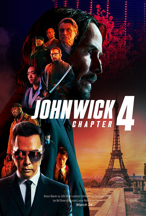
As a huge fan of the John Wick series, I wanted to make my own rendition of a John Wick 4 Movie poster.
John Wick poster designs typically feature a bold, striking image of the eponymous character, played by Keanu Reeves. In most posters, John Wick is prominently featured in the center of the image, with his face and upper body visible. He is often shown holding a gun, with a serious or determined expression on his face. While this is typical for these types of posters, I wanted to show off what's at stake in the story, which is he is out of time
Overall, the John Wick poster conveys a sense of high-octane action and intense drama, with a focus on the iconic character of John Wick and his skills as a lethal assassin.
For a more action-packed experience

INSPIRATIONS
In my exploration of movie posters, there are some that stood out to be more suited to what I want with the design. Seeing as there are a lot of characters played by well-known actors, having them be inside the main character to me was the best direction.


THEMES
The movie's theme from the initial trailer is that time is running out for John Wick and his companions. There was a picture of an hourglass. I wanted to use that as a key theme within the poster design.
LOCATIONS
Paris
Japan


FIRST ROUND
In my first rendition, it was deciding on an overall layout. In addition, look at what background to put for the composition. For the first round, I tried a more nighttime feel with the Osaka Hotel and cherry blossom tree with a lot of negative space.

QUESTIONS I ASKED MY SELF
Do the characters look like they are in a good position? How can I improve on it?
Is the background working? What does this background say about the movie?
Do I stick where the title text is at?
SECOND ROUND
In the second round, I focused on adding the two big locations into the design. I also zoomed in and added more color and saturation to make the characters pop.
This could have been a good stopping point, but I wanted to go in a different direction.
QUESTIONS I ASKED MY SELF
Is the placement of the title text good? Seems a bit off and blocks characters. Also seems uneven within the composition.
THIRD ROUND
In the third round of design, I decided to change up the background and use the hourglass concept. This will give the viewer a semblance of time has run out which gives more cohesion to the movies premise and this poster design.

QUESTIONS I ASKED MY SELF
Could you go more on the colors as seen with Mr. Wick's blue and red highlights?
FINAL ROUND
In my final rendition, the major change I did was to edit the title. Taking away the red with the neon outline I decided to just have the neon lights. It fits more with the theme and the poster design is better for it.


FINAL THOUGHTS
Overall the experience of working on this project was rewarding because It was an accomplishment to put my passion for movies and poster design to use. The outcome of the design was better than I envisioned initially.