

GHOST PROTOCOL
Logo Design
ROLE
Branding
Marketing
TEAM
Logo Designer
Solo
YEAR
2022
TOOLS
Illustrator, Photoshop
BACKGROUND
This project was given by an up-and-coming gaming studio Fragment. They are a small developing company needing a logo designer for their new first-person shooter, Ghost Protocol: Hard Rain.
MY ROLE
Logo design for an innovative game company startup Fragment.
THE PROCESS
After brand research and marketing research, as the designer, I worked in several stylistic directions. As for the color palette, the clients primarily wanted it to be a monochromatic color scheme but were open to a color change for diversity. the client's set of preferences for the tone of the logo was to have, techno. designs that can be white or black. So, the main direction was focused on the angular stylizing type. The logo versions were made monochrome applying a flat style of graphic design.
DISCOVERY
I wanted to see what our competitors had in their designs. Some go minimal and others are more complex and flashy. Going through the competitors to a wordmark or combination mark.


LOGO
The client wanted a logo for the game, along with a logotype. They wanted to have a skull that could be recognizable, iconic, and universal with any future installments in the series. So first was getting down a tone and creating a range of designs I call the wall of skulls,

MINIMAL
The client wanted an emblem to be skulls so I thought starting off from a minimal baseline could help bring a concept to life. The process of having a jaw or not was an element I was playing with throughout my process.

GRUNGE
I wanted to tackle this grunge esthetic, Ghost Squad are menacing and fierce individuals invoking fear into their enemies. I wanted to get that fear and intense look into the emblem.

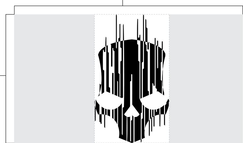
GLITCHY
The other route esthetic was appealing to the game's more technological side. the game is set in 2030 so I wanted to give the Ghost Team more of a technical style while still feeling menacing.

TYPOGRAPHY
For the typography exploration, I was going through a few different styles. Going more of a similar Call of Duty type route with Oswald and Korolev. Finally landing on Neuzeit Grotesk Black paired with Solano Gothic Pro was my direction going further in the design.
EXPERIMENTING

TOP PICKS

FINAL RENDITION


LOGO PACKAGE

WORDMARK
LOGOMARK

INVERT
BLACK
WHITE
1920px
1080px

1920px
1080px
1000px

500px
100px
1000px
500px
100px
DISPLAYS


